Rooting in my loft recently I came across an old board game called The Magnificent Race. Clearly inspired by the TV show The Wacky Races, it was the artistic style that jogged my memory.
This style, a sort of Victorian cartoon, was everywhere when I was growing up in the late Sixties and I recall it blossoming in the Seventies. Everything from games, wallpaper, Avon soaps, chocolates, sweets to TV shows like Monty Python's Flying Circus got the treatment. Terry Gilliam's designs even incorporated the circus-style Victorian typeface [unsure of its name].
Avon soaps went in for this dandy style a lot and here's their Barber Pole packaging in a slight;y more realistic finish.
Often the designs featured London Lifeguards and Beefeaters as on this ceramic piggy bank
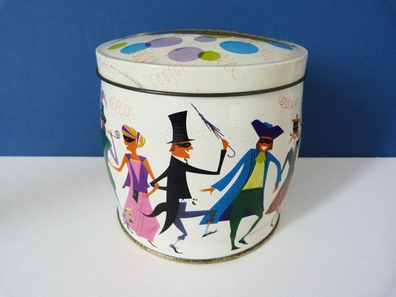
Sometimes the style embraced Harlequins and masked Balls as on this Sweets tin.
and the classic Lifeguard as on the flanks of this Smarties Easter Egg
but the figures I recall the most are circus ringmasters and strongmen like the one in the middle of this Cadbury's biscuit barrel.
Oddly enough I found it surprisingly hard to find online examples of this style in general and in particular ringmasters and strongmen. Examples or links would be welcomed.
Was it a peculiarly British design fad or was it worldwide in the Seventies readers?


The Monty Python typeface is this:
ReplyDeletehttp://www.linotype.com/1201/Madame-family.html
Click on the "Details and Background Information" tab for a brief history.
Fascinating Richard, cheers. So its an old font. 1820! It does look French. Just realised that each letter has a can-can corset on! ha ha
DeleteI see exactly what you mean about the Victorian pastiche style! I always associate the very late Sixties and very early Seventies in America with a revival of Art Nouveau styles and Tiffany lamps. In both cases, maybe it was a reaction to Hippies being seen as messy and ungroomed, and public taste wanting to go back to something that was perceived as more elegant and stylized?
ReplyDeleteyes, Art Nouveau and Tiffany, very cozy and comfortable aren't they Richard, maybe even decadent and as you say a mainstream reaction to the wildness of youth. Its odd though, the Seventies Victorian style seemed to be aimed at kids and teenagers, what with the toys, soaps, shaving creams, after shaves etc all packaged in that dandy style. Seeing it makes me think of Terence Conran's Book of the House, the epitome of Seventies domestic cool. Maybe the rise of Kath Kidson's wares is a similar throwback to simpler times?
Deleteworld wide was big in oz
ReplyDeletethink of music in late 60s with this look like beatles or bonzo dog doo dah band
i remember fast food outlets with victorian images mixed with lime, orange and hot dogs and burgers - plenty of ads too
Oz too eh Konsumterra! I loved the Bonzo Dog Doo Dah Band, Viv Stanshal and his I'm an Urban Spaceman Baby! Great! I wonder of this victorian style exists anywhere now?
Deletemore steampunk movies made in 70s tha any other time
ReplyDeleteBut did they know they were Steampunk at the time?
DeleteI'm no expert, but I think the 60's playbill style typeface was actually used by "hippies" in magazines such as Oz, adopted by them, rather than as a reaction to them. Perhaps the popular culture aspect, eg. circuses, music hall etc. appealed. I think the sweet tin with the figures is more 1950s design than Victorian, seen and developed in 1950s magazines and advertising.
ReplyDeleteIts an interesting point Andy, was the Hippy use of playbill lettering part of the counter culture or not. Rick Griffin;s stylized lettering on Grateful Dead LP's began to look like graffiti so maybe that was reactionary? Its hard to say whether for instance Terry Gilliam was satirising the mainstream when he used the Madame typeface Richard has identified. I suppose at some point the counter culture became the mainstream.
DeleteI am not familiar with the game you mentioned, but the title rang a bell. Those Magnificent Men in Their Flying Machines, and The Great Race, both 1965, were set in Edwardian times, and featured long distance races involving aircraft and cars. The Great Race even had Jack Lemmon in a top hat as the dastardly villain. Looking up the game, it was by Parker Brothers. I found the date 1975, but perhaps this was a later edition of an earlier game ? The title, subject, and style all match the 1965 movies. Both good films.
ReplyDeleteThanks Paul. Very insightful about the films and games. Dunno why none of the pictures work on this old post anymore. I did love those old films and that Edwardian style. I found out this week that the artwork on Quality Street chocolates boxes and tins was inspired by Vanity Fair, which I assume is a Victorian or Edwardian book or play.
DeleteVanity Fair was a novel by William Makepeace Thackeray, and was set in the Napoleonic Wars. Published in 20 parts in 1847-48, and in book form in 1848. It has been filmed many times. I had to look all this up, as 19th century novels are hardly my main subject. Really nice artwork on the chocolate tins.
DeleteThanks for the update Paul. Fascinating!
Delete